Welcome
Thanks for coming!
Your turn
(1) Install the required software https://workshops.cpsievert.me/20171118/
(2) Run the docker container so that RStudio appears when you visit http://localhost:8787 (in Chrome or Firefox, please!)
(3) In the R console, enter
browseURL("~/day1/index.html")If you see this popup, press "Try Again".

(4) Go to Tools -> Global Options and configure your pane layout like this.

(5) Share (w/ your neighbor) 3 things you're hoping to take away from this workshop (share them via Slack if you like!)
About me
Maintainer of plotly's R package (for nearly 3 years!)
- Before that: animint, LDAvis, pitchRx, rdom
PhD in statistics from Iowa State
Founder & CEO, Sievert Consulting LLC
- Currently looking for more projects!
Is there anything in particular that you would like covered?
- I'm most interested in linking and animating views without shiny. Already pretty well acquainted with R/RStudio/Plotly, but hoping to learn how to use Plotly more efficiently and extend my current usage with animation, crosstalk, etc. I use Plotly most often within flexdashboard applications, so most interested in non-Shiny options.
- I want to learn how to animate my plotly graphs/charts.
- More shiny dev
- Creating documents with data visualizations in Markdown files. I've been working to get better with Markdown, but if there's a way to include interactive visualizations and/or animations in Markdown files that can be sent to readers that would be great. I work in consulting so I often need to send reports to executives and including interactive data visualizations in those reports would be incredibly useful for me.
- Looks good! Stoked for the class. For me, I don't use rmarkdown and rarely use ggplot2 - so those could be dropped from the list.
- Looks like all of Day1 currently would be old news. Wouldn't half a day of R/RStudio/ggplot2 suffice for your audience?
Is there anything else that we can help you with at the workshop?
- I'd like to know how plotly performs with displaying large data sets
- Plotting large amounts of time series data efficiently
- Plotly custom controls and mapping options.
- Learn how to apply interactive filters in Plotly if that's supported (e.g. click on a single bar within a bar chart on the left which filters the heat-map to the right).
- More advanced visualization techniques such as a chord diagram or a sunburst
- Check out sunburstR
- Suggestions/hints on how to create clean, good code would be especially appreciated.
- Check out tidyverse
- Extended breakout session time for help on specific project i am bringing
I'll try my best -- 2 days is not enough!
PLEASE PLEASE PLEASE stop me to clarify and/or ask questions
A minimal bar chart
- Every plotly chart is powered by plotly.js, plus some extra R/JS magic 🎩 🐰.
- How/why did
plot_ly()draw a bar chart? What if we want something different?
library(plotly)plot_ly(x = c("A", "B"), y = 1:2)Your turn
In your R console enter:
file.edit('~/day1/your-turn.R')Work through the comments/code/questions in this R script.
Feel free to work with your neighbor and ask me questions!
If you have question(s) about it rmarkdown, now would be a good time to ask (we won't have time to cover it together).
PS. Did you know the workshop slides were created with rmarkdown?
The scatter trace type is quite general. It provides the foundation for many charts (e.g., polygons, ribbons, filled areas, etc), extends to different coordinate systems (e.g, scatter3d, scattergeo, and scattermapbox), and rendering systems (e.g., scattergl)
subplot(shareY = TRUE, plot_ly(x = 1:2, y = 1:2), plot_ly(x = 1:2, y = 1:2, mode = "lines"), plot_ly(x = 1:2, y = 1:2, mode = "markers+lines"), plot_ly(x = 1:2, y = 1:2, text = 1:2, mode = "text"), plot_ly(x = 1:2, y = 1:2, text = 1:2, mode = "markers+lines+text"))Working with actual data
file.edit('~/day1/demo.R')Which visualization is better?
subplot(shareX = TRUE, nrows = 2, plot_ly(logs, x = ~date, y = ~package, z = ~count, type = "heatmap"), plot_ly(logs, x = ~date, y = ~count, color = ~package, mode = "lines"))Famous question: which is larger (and by how much)? A or B?
These questions drive at least two influential papers:
This figure is from Data Visualization for Social Science (highly recommended!) in reference to Bostock and Heer.
Position is best, especially along common scale and baseline
Figure from Heer and Bostock (2010)
A more general guideline from Cleveland and McGill
- Figure from Data Points: Visualization That Means Something by Nathan Yau
Interactive techniques can aid in these tasks
Again, which is better?
Graphing 5 time series
——————————
Graphing 5 time series
——————————
1,000 time series!
With all my installed.packages(), yikes!
plot_ly(logz, x = ~date, y = ~count) %>% group_by(package) %>% add_lines(alpha=0.3)Can improve a bit with interaction
library(crosstalk)SharedData$new(logz, ~package, "Select package(s)") %>% plot_ly(x = ~date, y = ~count) %>% group_by(package) %>% add_lines(alpha=0.3) %>% highlight(dynamic = TRUE, selectize = TRUE, persistent = TRUE)heatmaply is awesome for visualizing a numeric matrices!
Graphing 1,000 time series
——————————
Graphing 1,000 time series
——————————
1,000,000 time series!
Overview first, then zoom and filter, then details on demand
Ben Shneiderman
Popular information visualization perspective
Visualization surprise, but don't scale well. Models scale well, but don't surprise
Hadley Wickham
Popular statistical graphics perspective
Your turn
Have a look at some plotly "extension" packages!
Exercise: Most of these packages have a function that returns a plotly object (e.g., heatmaply::heatmaply()). Use a plotly function to modify/customize the result (e.g., add a title with plotly::layout())
For all CRAN packages that use plotly, see the "Reverse dependencies" section on https://cran.r-project.org/package=plotly
What about long time series?
- Hundreds of thousands time series points is responsive with WebGL (but no rangeslider (yet))
y <- sample(c(-1, 1), 1e5, TRUE)x <- seq(Sys.time(), Sys.time() + length(y) - 1, by = "1 sec")plot_ly(x = x, y = cumsum(y)) %>% add_lines() %>% toWebGL()
What about performance (beyond time-series)?
SVG vs Canvas, in general
- The Scalable in SVG, means scalable in terms of bounding box size.
- No matter the context, your browser will struggle to render > 30,000 SVG elements.
- This is why canvas based elements exist (the difference is similar to pdf vs png)
Time series doesn't scale well, even in a canvas context
- Time series has performance limitations that other data types don't (this is pretty universal).
High performance plotly charts
- scattergl -- basically same as scatter (with limitations), but responsive with >1M points.
- pointcloud -- more restricted than scattergl, but responsive w/ several million points.
- heatmapgl -- response with >1M cells in heatmap.
More time series tips
Have lots of long time series?
Consider extracting/visualizing features from each series
- Some useful packages: anomalous and tscognostics
- See my work on visualizing pedestrian traffic with plotly
Consider a tool like trelliscope for exploring many "groups"
Visualization of models/predictions?
- Start with forecast and/or mgcv for model fitting.
- Use a strategy similar to here to plot forecasts.
Is seasonality important?
- Consider "wrapping" your time-series
Texas housing prices
library(dplyr)tx <- txhousing %>% select(city, year, month, median) %>% filter(city %in% c("Galveston", "Midland", "Odessa", "South Padre Island"))tx#> # A tibble: 748 x 4#> city year month median#> <chr> <int> <int> <dbl>#> 1 Galveston 2000 1 95000#> 2 Galveston 2000 2 100000#> 3 Galveston 2000 3 98300#> 4 Galveston 2000 4 111100#> 5 Galveston 2000 5 89200#> 6 Galveston 2000 6 108600#> 7 Galveston 2000 7 99000#> 8 Galveston 2000 8 96200#> 9 Galveston 2000 9 104000#> 10 Galveston 2000 10 118800#> # ... with 738 more rowsWrap by year, facet by city
ggplot(tx, aes(month, median, group = year)) + geom_line() + facet_wrap(~city, ncol = 2)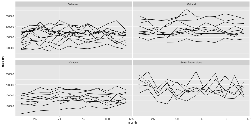
Compare across cities within year and across years within city
TX <- SharedData$new(tx, ~year)p <- ggplot(TX, aes(month, median, group = year)) + geom_line() + facet_wrap(~city, ncol = 2)(gg <- ggplotly(p, tooltip = "year"))Set selection mode and default selections
highlight(gg, "plotly_hover", defaultValues = "2006")Make comparisons with dynamic brush
highlight(gg, dynamic = TRUE, persistent = TRUE, selectize = TRUE)Customize the appearance of selections
highlight( gg, dynamic = TRUE, persistent = TRUE, selected = attrs_selected(mode = "markers+lines", marker = list(symbol = "x")))Automate queries via animation
p <- ggplot(tx, aes(month, median)) + geom_line(aes(group = year), alpha = 0.2) + geom_line(aes(frame = year), color = "red") + facet_wrap(~city, ncol = 2)ggplotly(p)Your turn
Visit this post, replicate the example (no install needed), and use trelliscope to visualize txhousing (or, more preferably, your own data!)