Texas housing prices
library(dplyr)tx <- txhousing %>% select(city, year, month, median) %>% filter(city %in% c("Galveston", "Midland", "Odessa", "South Padre Island"))tx#> # A tibble: 748 x 4#> city year month median#> <chr> <int> <int> <dbl>#> 1 Galveston 2000 1 95000#> 2 Galveston 2000 2 100000#> 3 Galveston 2000 3 98300#> 4 Galveston 2000 4 111100#> 5 Galveston 2000 5 89200#> 6 Galveston 2000 6 108600#> 7 Galveston 2000 7 99000#> 8 Galveston 2000 8 96200#> 9 Galveston 2000 9 104000#> 10 Galveston 2000 10 118800#> # ... with 738 more rowsHighlighting in small multiples
TX <- SharedData$new(tx, ~year)p <- ggplot(TX, aes(month, median, group = year)) + geom_line() + facet_wrap(~city, ncol = 2)(gg <- ggplotly(p, tooltip = "year"))Query missing values by city
The 'data pipeline'
library(plotly)library(crosstalk)sd <- SharedData$new(txhousing, ~city, "Select a city")base <- plot_ly(sd, color = I("black"), height = 400) %>% group_by(city)p1 <- base %>% summarise(miss = sum(is.na(median))) %>% filter(miss > 0) %>% arrange(miss) %>% add_bars(x = ~miss, y = ~factor(city, levels = city), hoverinfo = "x+y") %>% layout( barmode = "overlay", xaxis = list(title = "Number of months missing"), yaxis = list(title = "") ) p2 <- base %>% add_lines(x = ~date, y = ~median, alpha = 0.3) %>% layout(xaxis = list(title = "")) subplot(p1, p2, titleX = TRUE, widths = c(0.3, 0.7)) %>% layout(margin = list(l = 120)) %>% hide_legend() %>% highlight(dynamic = TRUE, persistent = TRUE, selectize = TRUE)Britney: So what? I can do this with shiny.
Where is the pipeline?
Standalone web pages are much easier to share, deploy, maintain.
The general model
Links are specified in R, but the "updating logic" is JavaScript -- no server required!
Your turn
(1) Modify the 'pipeline' demo so that markers (instead of bars) encode # of missing values (like it does in the diagram).
(2) Highlight cities by brushing marker(s) (hint: linked brushing isn't be enabled by default, see help(highlight))
Aggregating selections
# These examples demonstrate ways to display binned/aggregated selectionslibrary(crosstalk)library(plotly)d <- SharedData$new(mtcars)sp <- plot_ly(d, x = ~mpg, y = ~disp) %>% add_markers(color = I("black"))# hist/box/violin are all 'statistical trace types' meaning# they compute aggregations on the flyhist <- plot_ly(d, x = ~factor(cyl)) %>% add_histogram(color = I("black"))box <- plot_ly(d, y = ~disp, color = I("black")) %>% add_boxplot(name = " ")violin <- plot_ly(d, y = ~disp, color = I("black")) %>% add_trace(type = "violin", name = " ")subplot(sp, box, violin, shareY = TRUE, titleX = TRUE, titleY = TRUE) %>% subplot(hist, widths = c(.75, .25), titleX = TRUE, titleY = TRUE) %>% layout( barmode = "overlay", title = "Click and drag scatterplot", showlegend = FALSE ) %>% highlight( "plotly_selected", selected = attrs_selected(showlegend = FALSE) )Aggregating selections (continued)
# These examples demonstrate ways to display binned/aggregated selectionslibrary(crosstalk)library(plotly)d <- SharedData$new(mpg)dots <- plot_ly(d, color = ~class, x = ~displ, y = ~cyl)boxs <- plot_ly(d, color = ~class, x = ~class, y = ~cty) %>% add_boxplot()bars <- plot_ly(d, x = ~class, color = ~class)subplot(dots, boxs, titleX = TRUE, titleY = TRUE) %>% subplot(bars, nrows = 2, titleX = TRUE, titleY = TRUE) %>% layout( title = "Click and drag on scatterplot", barmode = "overlay", showlegend = FALSE ) %>% highlight("plotly_selected")Aggregating selections (continued)
# These examples demonstrate ways to display binned/aggregated selectionslibrary(crosstalk)library(plotly)tx <- SharedData$new(txhousing, ~city)p1 <- ggplot(tx, aes(date, median, group = city)) + geom_line() + xlab(NULL)gg1 <- ggplotly(p1, tooltip = c("city", "date", "median"))p2 <- plot_ly(tx, x = ~median, color = I("black")) %>% add_histogram(histnorm = "probability density")subplot(gg1, p2, titleX = TRUE, titleY = TRUE) %>% layout(barmode = "overlay") %>% highlight( dynamic = TRUE, persistent = TRUE, selected = attrs_selected(opacity = 0.3) )Selections inherit animation frames!
Your turn
Check out one or two more demos that come with the package
demo(package = "plotly")PS
- Once you have a topic, say "ternary", you can run it like this demo("ternary", package = "plotly")
- If you'd like to see/edit the source code, do something like file.edit(system.file("demo", "ternary.R", package = "plotly"))
You can only go so far without shiny...
...but we can combine powers
I promise...
We will get to shiny, but we haven't covered filter events yet!
Filter vs highlight
The highlight() function sets options for highlight events.
Highlight events dim the opacity of existing marks.
Filter events completely removes existing marks and rescales axes.1
At least currently, filter events must be fired from crosstalk widgets.
[1]: when using ggplotly(), you need to specify dynamicTicks = TRUE
Crosstalk's filtering widgets
tx <- SharedData$new(txhousing)widgets <- bscols( widths = c(12, 12, 12), filter_select("city", "Cities", tx, ~city), filter_slider("sales", "Sales", tx, ~sales), filter_checkbox("year", "Years", tx, ~year, inline = TRUE))widgetsFiltering
bscols( widths = c(4, 8), widgets, plot_ly(tx, x = ~date, y = ~median, showlegend = FALSE) %>% add_lines(color = ~city, colors = "black"))Talk to other crosstalk-enabled widgets
library(leaflet)sd <- SharedData$new(quakes)p <- plot_ly(sd, x = ~depth, y = ~mag) %>% add_markers(alpha = 0.5) %>% highlight("plotly_selected")map <- leaflet(sd) %>% addTiles() %>% addCircles()bscols(p, map)Your turn
Add some filter widgets to the earthquakes example. Use htmltools::save_html() to save the result
Recreate the leaflet() map with plot_mapbox()
Full solution is in your-turn/01.R file
Expectations vs reality

plotly has advanced support for highlight events (e.g., persistent, dynamic, selectize)
Other crosstalk-enabled htmlwidgets likely won't respect (non-default) highlight() options.
However, filter events should generally be supported.
Hello  👋
👋
shiny::runApp("~/day2/shiny/01", display.mode = "showcase")Accessing plotly user events
shiny::runApp("~/day2/shiny/02", display.mode = "showcase")Your turn
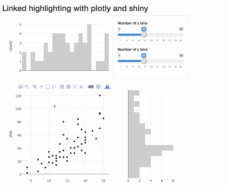
Program an app to populate a bar chart reflecting the selection, sort of like this (using cars data):
Targetting events (only if we have time)
shiny::runApp("~/day2/shiny/03", display.mode = "showcase")plotly proxies
By default, shiny updates require a full redraw, but proxies allows us to leverage the plotly.js API to modify/update graphs more efficiently
shiny::runApp("~/day2/shiny/04", display.mode = "showcase")Streaming data
shiny::runApp("~/day2/shiny/05", display.mode = "showcase")Inspired by https://plot.ly/r/streaming/
Your turn
Open the last example
file.edit("day2/shiny/05/app.R")Try to do the following:
Add
sliderInput()for controlling the streaming interval and the number of points added in each update.Add another (streaming) trace
This is the last your turn, and I have a 6pm flight to catch, so ask me any other questions now!
Thanks!
Resources for more learning:
https://plot.ly/r/
https://plotly-book.cpsievert.me
https://talks.cpsievert.me
https://github.com/cpsievert/phd-thesis
https://github.com/cpsievert/pedestrians
https://github.com/cpsievert/bcviz
https://github.com/cpsievert/apps
Reach out to me
Web: http://cpsievert.me/
Twitter: @cpsievert
GitHub: @cpsievert
Email: cpsievert1@gmail.com
Ask me anything!!
Want something to do? Some ideas:
- Read about the new api interface --
help(api). - Read about JavaScript customization